Great Charts
Playfair
Playfair has inspired our entire competition for good reason. His charts were simple, clean and precise.
For Playfair, a good chart should be memorable and complete. Any reader should be able to understand exactly what the data is showing, and recall this information for a considerable amount of time.
Nightingale
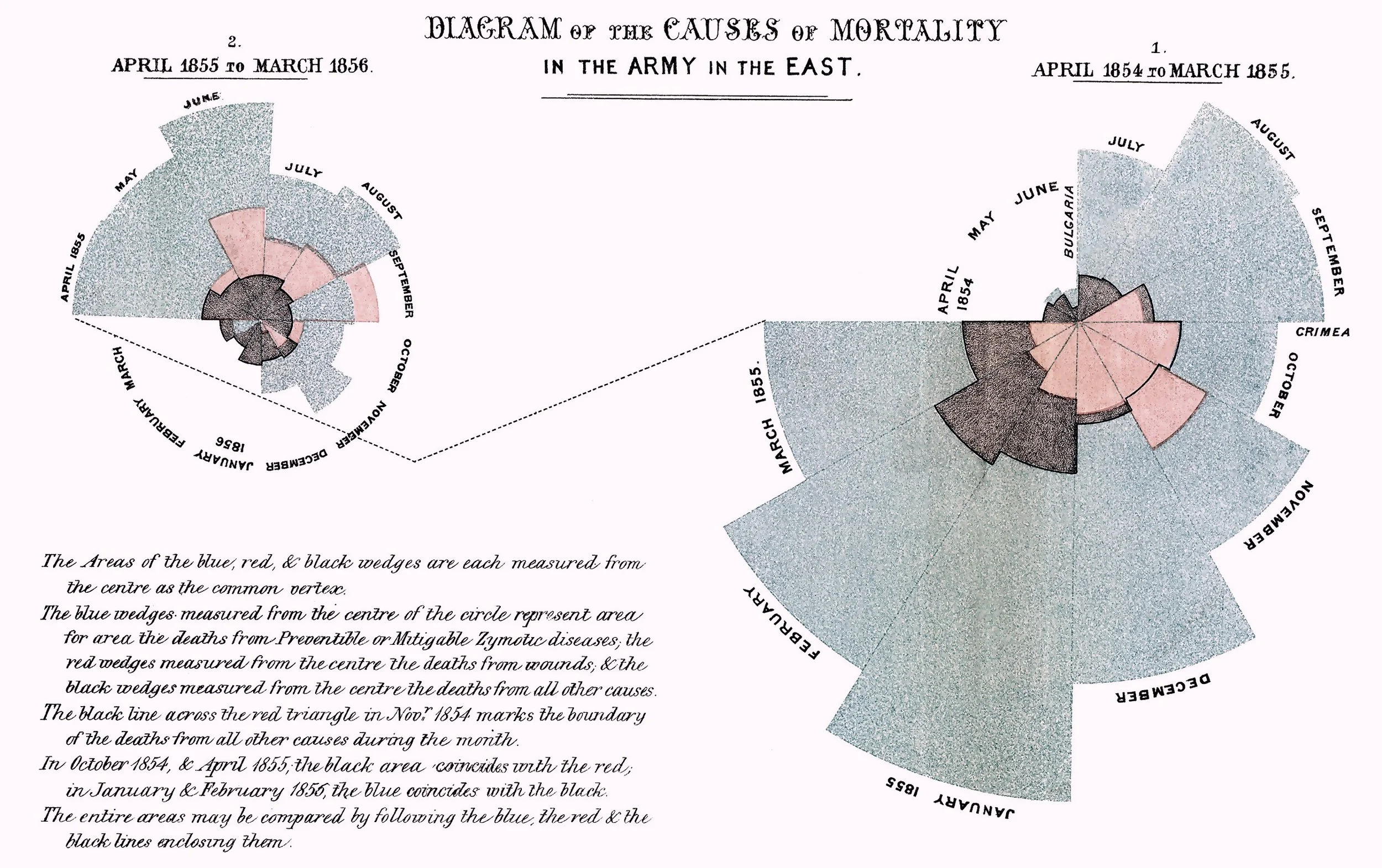
Nightingale, another hero, created a chart to suit the dataset she had available.
The polar area chart illustrates the causes of death during the Crimean war using a collection of ‘coxcombs’. The coxcombs are divided into three categories: "Preventible or Mitigable Zymotic Diseases" (‘infections’, coloured in blue), "wounds" (red) and "all other causes" (black).
bank of England Fan chart
Introduced in 1996, the Bank of England printed its first fan chart in its February Inflation Report. February 1996.
The fan chart is a combination of a line chart, which illustrates all available data, and a distribution which indicates the range of possible values in the future. The aim of the fan chart was to convey a more accurate representation of the Bank’s forecast of medium-term inflationary pressures, but without implying a false degree of precision.
See the original fan chart on page 48, here.


