Chartjunk
Now that you know how to spot a great chart, you also need to know how to steer clear of a totally rubbish one too. First coined by Edward Tufte the term 'chartjunk' refers to any element of a graph which distracts the viewer from the chart's core information. Here are some of our worst examples.
Planned parenthood
There are only 4 data points in this chart. The arrows, which could be mistaken as lines of a line graph, are indeed just arrows. At a glance you would assume the chart is illustrating an increase in abortions has led to a decrease in cancer screening. There are no data points for any dates between 2007 and 2012.
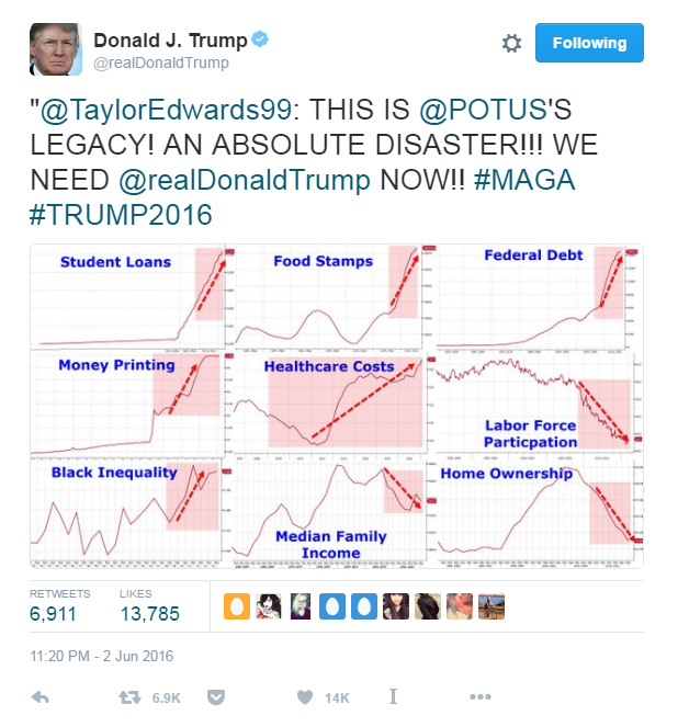
US Economic 'disaster'
Where do we begin with this one? Posted as a collection of charts, the source of the data and the axes are indistinguishable. The red blocks coupled with the red arrows are unnecessary; a good chart should be able to speak for itself, and the key takeaway should be obvious to the viewer.
UK Growth estimates
The first cardinal rule of bar charts is the y axis should always begin at zero. Data is conveyed through length in a bar chart, so starting at 0.55% distorts the visualisation.
Halloween Consumption
Spending by Americans on Halloween in USD. This chart is definitely terrifying.
bank of England
Not everything needs to be a chart, here's a perfect example of that. In fact the chart is so obvious, you stop to wonder why this couldn't simply be written as a sentence. Marginal cost remains at under 5% at every bank capital level.
Trends in Cigarette Tax
Axes are a crucial element of a chart, it’s never a good idea to turn the axis into a cigarette.
“Lurking behind chartjunk is contempt both for information and for the audience. Chartjunk promoters imagine that numbers and details are boring, dull, and tedious, requiring ornament to enliven.
”


